
People are constantly interacting with information. From browsing Pinterest for decor ideas to looking to buy a new coffee machine, we interact with information every day. Today, we’ll take a closer look at the interaction of information seeking. Information Seeking is the act of searching; that is, making a conscious effort to acquire information in response to a need or a knowledge gap.
By understanding how people search, you can improve your UX design to create more relevant search pages and in turn, a better search experience. This will allow users to find the information they need, when they need it, in the way they desire — and, ultimately, convert.
A Little Bit of History
How people search for information has been a subject of interest in the library sciences field for decades, long before Google Search arrived.
With the rise of new computer systems in the 1970s, scientists became more interested in the information retrieval process and felt they needed clearer models on how to go about finding information in a computer environment. At the time, scientists were mainly focused on the behavior exhibited by research professionals as opposed to everyday information seeking.
Scientists came up with this classic model of information seeking, which is, as you can see, pretty simple:
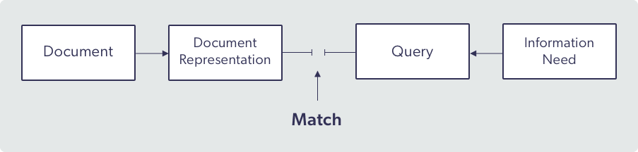
The problem with this model is exactly that: it’s too simple. It doesn’t take the context, the type of information sought, or the user and their intent into account. This model assumes that a user knows what it is that they need, that there is an answer to match it, and that the answer will be delivered in a single, linear transaction – none of these are actually guaranteed.
The reality is that the user doesn’t always know what they’re looking for and there isn’t always necessarily a right answer. And a search is not always a one-and-done process, as one search can lead to another search, and so on.
Dr. Marcia Bates, professor Emerita of Information Studies, recognized that there was a need for a model that shows how people actually search – a model showing how any person would look for information in everyday life. She created the “berrypicking” model (1989) to do just that, and it remains one of the best cognitive models of how people search for information online.
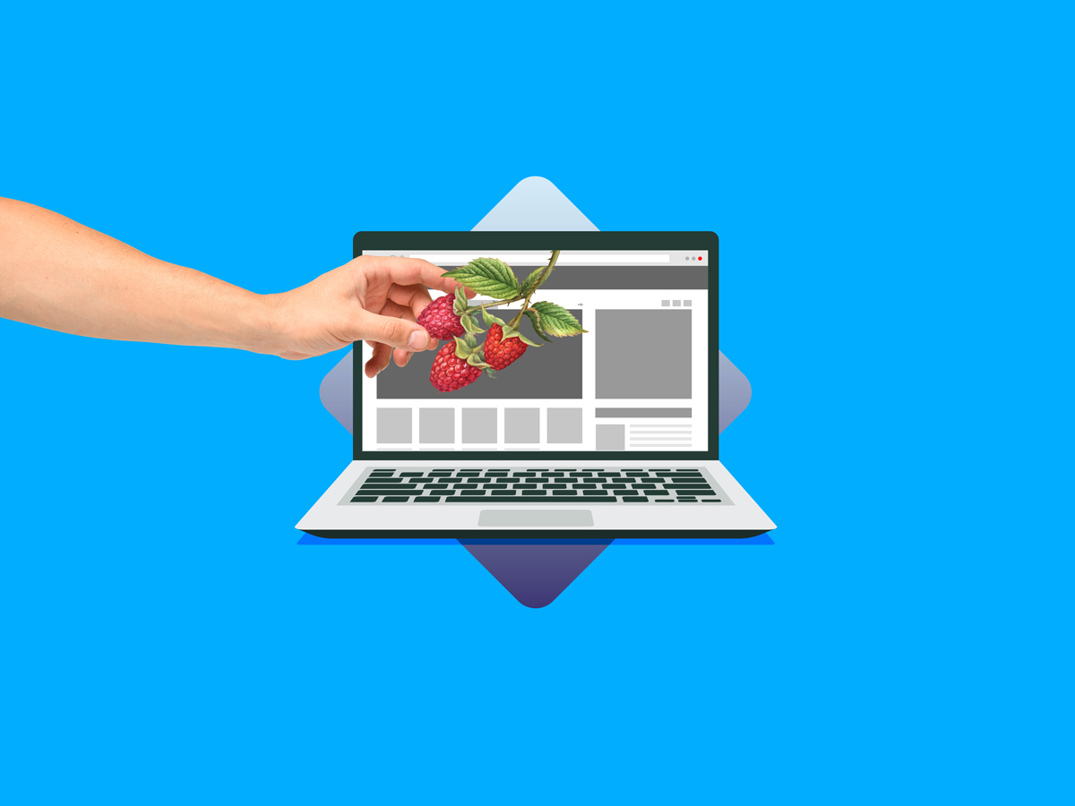
Picking Berries and Tracking Information Scent
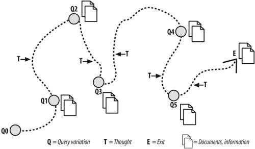
In Bates’s model, information seeking is compared to berry picking. Users are depicted as moving iteratively in a given information environment, collecting information (berries), changing queries and varying search strategies along their journey.
The inclusion of change, evolution, and specification as factors characterizing search activity is interesting, as it reveals that search is not a systematic process and can be distributed in space and time.
Other scientists have compared information seeking with looking for food, like Pirolli and Card (1995) with their Information Foraging Theory. This theory, derived from optimal foraging theory in biology and anthropology, explains why people don’t click on every result in a search page and why they don’t scroll down every webpage. It’s for the same reason that animals don’t roam every square inch of a field when looking for food – the effort required would be disproportionate to the information (or food) gained.
It’s true that clicking on every result link would probably give the user more information, but the information simply isn’t worth the search effort.
On the berry picking journey, users decide which links to click (or not to click) based on how much information they estimate they will get from that click. Like animals decide which area to forage based on the scent they catch from the environment, web users make their value estimate based on information scent: the combination of tracks and clues that indicate that the desired information might be there.
On a search results page, information scent exuded by a result is the product of the components’ position, titles, images, icons, description text available, and filters offered. Depending on what the website visitor is looking for, the same source of information can have a powerful scent for a specific user and no scent at all for a different user with different information needs.
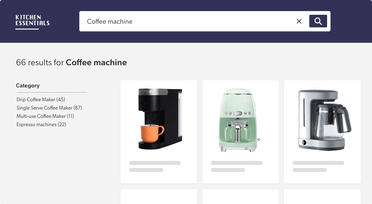
For example, if a user enters “coffee machine” as a search query in a search engine and sees results for sewing machines, then they might think that this website is unlikely to contain what they need because the scent points in a different direction.
From Search Psychology to Relevant Search Page Design
Now that we know more about the psychology of information seeking, you may wonder how this new knowledge will help us in real life, and that’s where I’m going! But first, a note on journey length.
The journey illustrated in the berrypicking model may look like an unsuccessful one because of its length. However, having a long search journey is not necessarily a bad thing – some information-seeking activities simply require a longer journey.
For example, a user looking to buy a coffee machine will probably look on multiple websites, read reviews, and may end with a purchase, or continue their search another day. In that case, a long journey would be fitting. But if the user is looking for the user guide for their brand-new coffee machine, then they will want to find it rapidly – a long journey would be a bad thing.
In short, the goal of the information journey (learn, explore, understand, buy, find, be entertained) will likely influence the length of the search journey.
Thanks to the berrypicking model, we know that in both cases – long and short journeys – the user is likely to reformulate their search query, move through the navigation menus, and use filtering options to refine their search.
To support the user on either journey we need to ensure the information scent is strong enough to guide them to the desired information. We also need to ensure the user can navigate easily in the environment without getting lost, because we know they might want to go back or do another search.
Knowing this can help us design one search interface that brings relevance into any journey, regardless of length.
5 Best Practices for a Relevant Search Page
1) Accessible search box. The search box needs to be accessible at all times. That means once a search has been performed, the search bar needs to stay visible and accessible for the user to do another search if needed.
Also, when a search is done, keep the query in the search box. That way the user knows and remembers what they searched for. Additionally, this keep their search options open in case they’d like to do further research.
2) Meaningful search result titles. The title link is probably the most important component of the information scent. This is what will motivate the user to click on the result. Titles should be clear and evocative. Avoid jargon, words not understood by the audience, and branded terms.
As Kara Pernice (2014) says: a link is a promise, and “any broken promise, large or small, chips away at trust and credibility. The words in a link label make a strong suggestion about the page that is being linked to. The destination page should fulfill what the anchor text promises.”
3) Descriptive images. When images are included in the search results, be sure to use images that are useful and have a strong information scent. To do that, avoid generic images that are only there for decorative purposes. Images should add cues to the title and be representative of the content it stands for.
4) Tags to increase information scent. Tags or labels are pieces of metadata that give information about results. They can be used to convey category, content type, and source – and they can even be used to bring attention to recommended content.
It is important to note that tags can support navigation or simply serve as visual indicators. For example, tags increase information scent in a document search because they give cues about what the document is about or where it comes from. On a commerce website, tags increase the information scent because they can differentiate a recommended product from one that is out of stock.
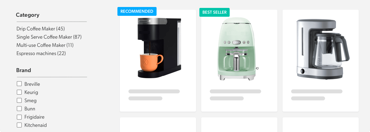
5) Strategic positioning to avoid “ad scent”. Users normally expect the search box to be on top, filters (facets) to be on the left, and results to occupy the most estate of the page. Historically, the right rail has been dedicated to ads.
Because of that, users developed what is called banner blindness, a phenomenon where users ignore content positioned where there are normally ads, content that looks like ads, and content close to ads.
This means designers need to be particularly careful when positioning important information like content recommendations on the right or close to ads, as there is a high risk users will ignore them. Generally, and especially if you intend to put recommended content on the right, user testing is recommended to ensure that users will recognize that important content for what it is.
Dig Deeper
Get inspired to improve your search results page for visitors by reading our post, 7 Sites with Search UX Best Practices You Should Steal.
To learn even more about relevant and high-converting search page web design and the elements it should include, read The Ultimate Guide to Site Search User Experience.